
https://developer.mozilla.org/en-US/docs/Web/CSS/linear-gradient()
linear-gradient() - CSS: Cascading Style Sheets | MDN
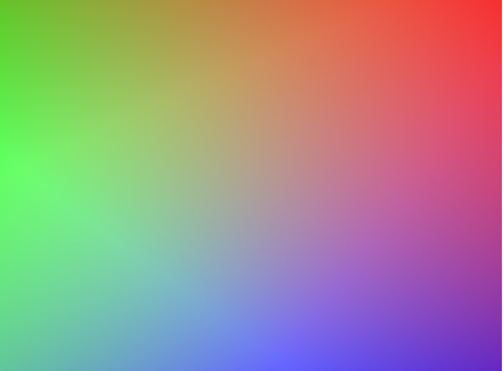
The linear-gradient() CSS function creates an image consisting of a progressive transition between two or more colors along a straight line. Its result is an object of the data type, which is a special kind of
.
developer.mozilla.org
바로 linear-gradient 속성이다.
/* 45 degrees(45도)로 시작하는 그라디언트이며,
파란색으로 시작해서 빨간색으로 끝나는 경우 */
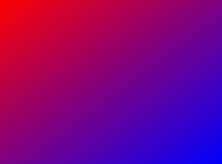
linear-gradient(45deg, blue, red);
/* 오른쪽 아래에서부터 왼쪽 위로 향하는 그라이언트이며,
파란색으로 시작해서 빨간색으로 끝나는 경우 */
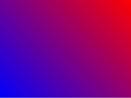
linear-gradient(to left top, blue, red);
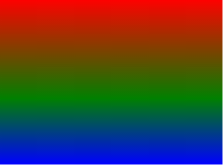
/* 아래에서 위로 가는 그라디언트이며,
파란색으로 시작해서 40% 지점에서 초록색이되고 빨간색으로 끝나는 경우 */
linear-gradient(0deg, blue, green 40%, red);
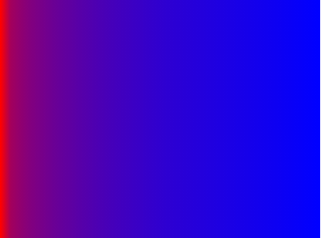
/* 왼쪽에서 오른쪽으로 가는 그라디언트이며,
빨간색으로 시작해서 10% 지점에서 두 색이 섞이는 지점을 두고,
나머지 90%는 파란색으로 변하도록 두는 경우 */
linear-gradient(.25turn, red, 10%, blue);
/* 45도로 시작하고
왼쪽 아래 반은 빨강, 오른쪽 위 반은 파란색이며,
hard line(명확한 구별라인)을 빨강과 파랑 사이에 두는 경우 */
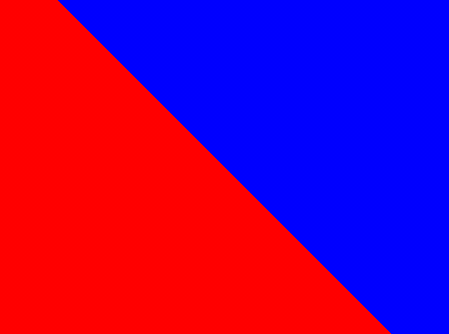
linear-gradient(45deg, red 0 50%, blue 50% 100%);
사용법은 다음과 같다.
참고로, 자주 사용하는 각도는 문자로도 정의 되어 있다.
| to top = 0deg | to bottom = 180deg | to left = 270deg | to right = 90deg |
| 파라미터 쉽게 설명 | 입력 예시 | 결과 예시 |
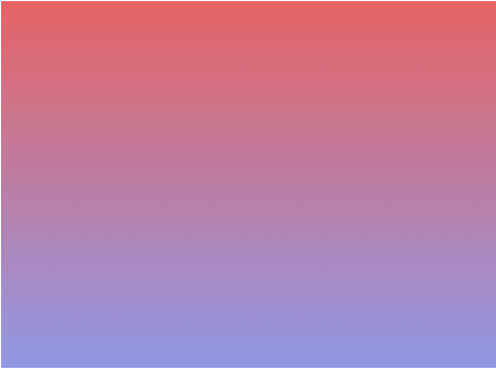
| background: linear-gradient(시작 색상, 끝 색상); 딱히 언급이 없다면, 기본 값은 0deg이며, 시작 색상은 위쪽이고, 끝 색상은 아래쪽이다. |
background: linear-gradient(#e66465, #9198e5); 시작색상(위) : #e66465 끝색상(아래) : #9198e5 |
 |
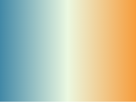
| background: linear-gradient(얼마만큼 회전할 것인지, 시작 색상, 중간 색상, 끝 색상); | background: linear-gradient(0.25turn, #3f87a6, #ebf8e1, #f69d3c); 1/4(90도=0.25turn)만큼 회전하면 가로로 그라데이션이 된다. 이번에는 색상을 세번 넣었다. 시작 색상(왼쪽) : #3f87a6 끝 색상(오른쪽) : #f69d3c |
 |
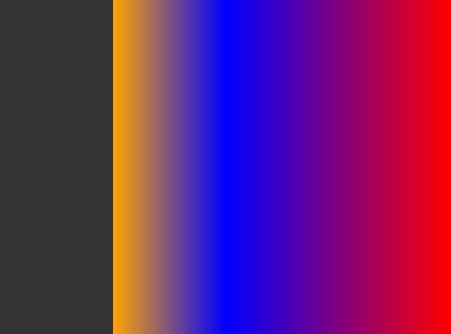
| background: linear-gradient(to left, 시작 색상, 중간색상 50%, 중간색상2 75%, 끝색상 75%); to left(270도)이므로 오른쪽부터 시작. 퍼센트의 의미는 공간의 그부분쯤에 색상을 칠하겠다는 의미이다. |
background: linear-gradient(to left, red, blue 50%, orange 75%, #333 75%); #333과 orange 색상이 저렇게 딱 분리된 이유는 #333에 75%를 주었기 때문이다. |
 |
| background: linear-gradient(시작각도, 색상설정), linear-gradient(시작각도, 색상설정), linear-gradient(시작각도, 색상설정); |
background: linear-gradient(217deg, rgba(255,0,0,.8), rgba(255,0,0,0) 70.71%), linear-gradient(127deg, rgba(0,255,0,.8), rgba(0,255,0,0) 70.71%), linear-gradient(336deg, rgba(0,0,255,.8), rgba(0,0,255,0) 70.71%); |
 |
그레디언트 색상 선택에 도움되는 사이트
↓↓↓↓↓
CSS Gradient — Generator, Maker, and Background
As a free css gradient generator tool, this website lets you create a colorful gradient background for your website, blog, or social media profile.
cssgradient.io
https://color.adobe.com/ko/create/color-wheel
https://color.adobe.com/ko/create/color-wheel
color.adobe.com
'WEB > CSS' 카테고리의 다른 글
| div 테두리 둥글게 만들기 + 테두리에 그림자 넣기 (0) | 2021.06.14 |
|---|